Realigning Design and Development: A StubHub Design System Case Study
By: Samuel Allotey
Introduction
In a bold response to post-pandemic challenges, StubHub embarked on a strategic overhaul of its design system to bridge the widening gap between its design and development practices. The project was ignited by a pressing need: post-layoff, the styles and components in the design tool, Sketch, no longer reflected the actual code library, leading to a disjointed user experience and inefficient workflows. This case study explores the journey to sync the design system in Figma (after migrating it from Sketch) with the code library, aiming to streamline cross-functional collaboration, achieve design consistency, and enhance system scalability.
Project Genesis
Objectives
The mission was clear: to create harmony between the Figma design system and the code core library. This alignment would empower designers and developers, fostering a unified language that would translate into a cohesive StubHub user experience. The goals were multifaceted: to solidify communication across teams, to standardize the feature sets, to optimize the design process, and to lay a scalable foundation for the design system.
Context
The onset of COVID-19 had left StubHub without a dedicated design team, a situation that led to fragmented workflows and a design system that was out of sync with the developers' code library. The task at hand was not only to realign these assets but also to rejuvenate a system that would stand the test of time and changing team structures.
My Role in Reunification
As the lead design system designer, I was at the helm of this ambitious project. My journey began with the migration of legacy design files from Sketch to Figma, a meticulous process that required a deep dive into the nuances of both platforms. The audit of the newly migrated design elements was next, a task that demanded a keen eye for detail and a steadfast commitment to accuracy.
Team Dynamics
Though I was the sole full-time designer on the design system, collaboration was key. Regular check-ins with the ten-strong design team ensured that their insights and needs were woven into the system’s fabric. This collaborative spirit was the heartbeat of the project, driving us toward a shared vision for StubHub's user experience.
Challenges Encountered and Overcome
Bridging Communication Gaps
Gathering feedback from cross-functional team members proved to be a formidable challenge. The solution lay in taking the initiative — rather than waiting for input, I sought alternative solutions, pushing the project forward relentlessly. When urgent feedback was necessary, escalation through management channels proved effective, ensuring that critical milestones were met.
Deciphering and Aligning Code
The intricacies of translating countless lines of TypeScript into Figma components were daunting. Yet, with time, I mastered reading and understanding this language, becoming an invaluable resource to the team and smoothing the path for seamless style alignment.
Ensuring Design Consistency
Divergent designs began to surface as individual team members created bespoke elements. The antidote was a "Temporary Design System" in Figma, a shared space where designers could contribute new components. This solution maintained creative dynamism while fostering uniformity across the product.
Process and Methodology
The development of the design system was a journey marked by a consistent research-design-feedback loop. Each phase was carefully crafted to ensure that the evolving system was not only reflective of current needs but also anticipatory of future trends.
Journey Mapping
A journey map workshop was a pivotal point in the process, illuminating the key user interactions across the StubHub platform. This exercise was instrumental in pinpointing inconsistencies and shaping the narrative for a more unified user experience.
Establishing a Source of Truth
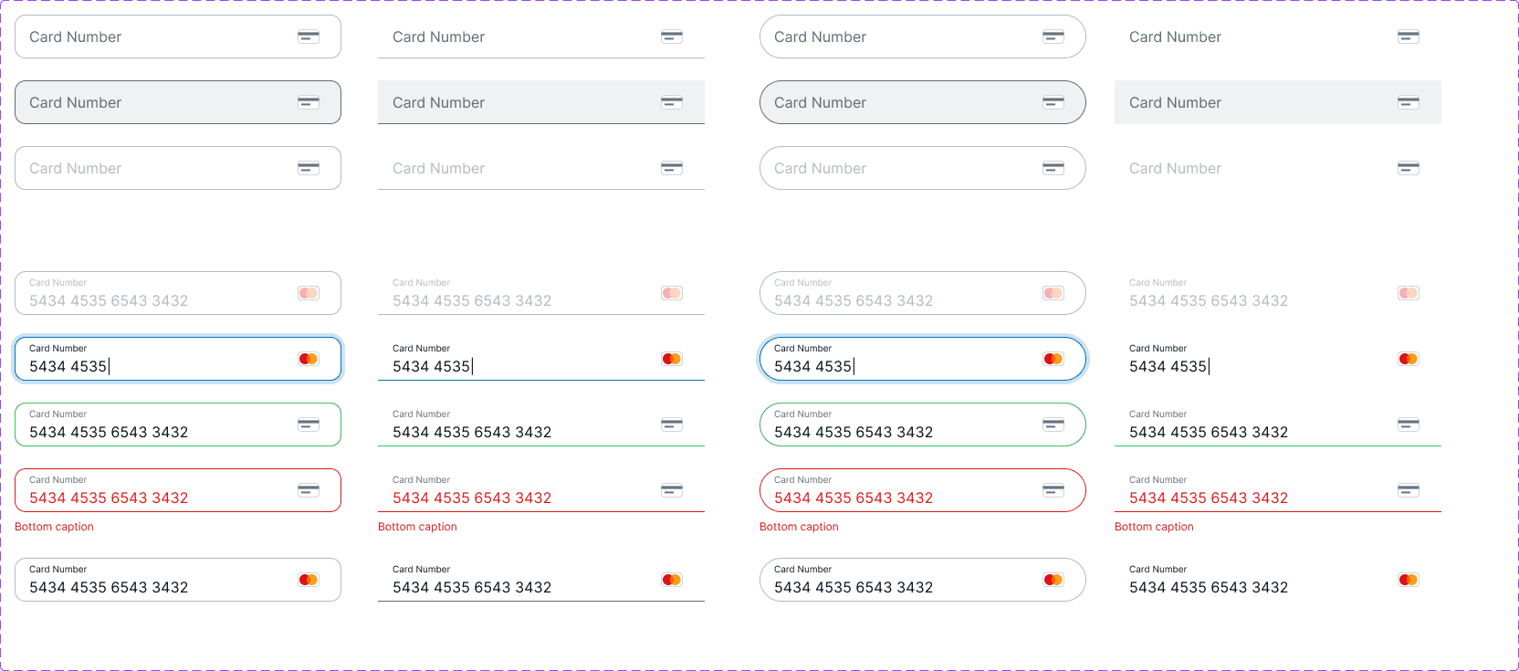
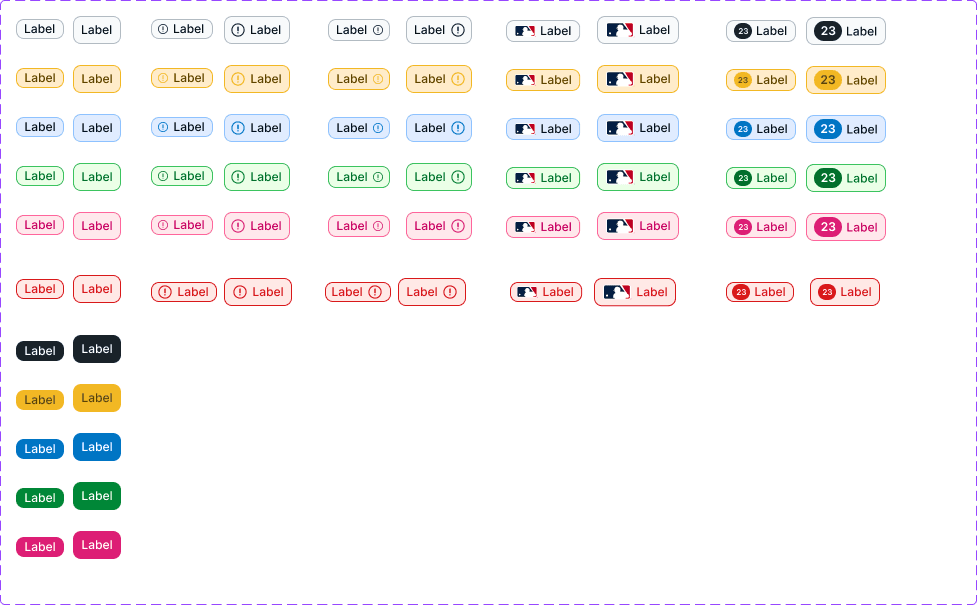
A living Figma file became the cornerstone of the design system, a single source of truth that mirrored the production environment and illustrated a forward-thinking vision for StubHub's platform. This dynamic document facilitated a shared understanding among designers and developers alike.
Decision-Making Framework
A decision tree was introduced to guide the team in evaluating when to craft new components versus utilizing existing ones. This tool provided a structured approach to innovation within the design system, ensuring that each addition was purposeful and coherent with the overarching system.

Tools Employed
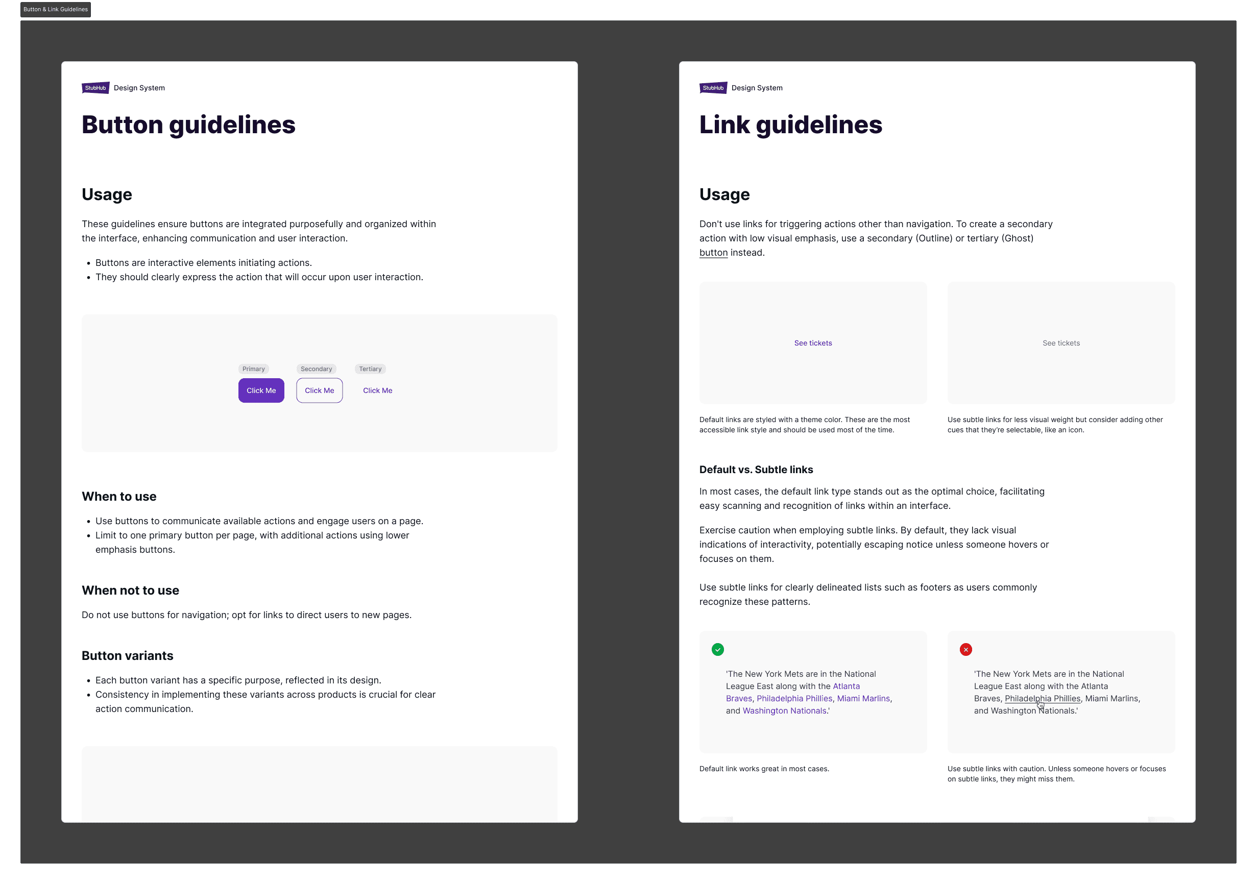
The primary tools of my trade were Figma for design execution and Figjam for ideation and research. Zeroheight was initially employed for documentation review, though its use was discontinued once it was identified as outdated.
Outcomes and System Evolution
The realignment of the design system with the code library marked a turning point for StubHub. Communication between designers and developers became more fluid, and the groundwork was laid for the next phase: streamlining components and purging redundancies. The impact on workflow was profound, empowering designers with ready access to components and styles, which in turn enhanced the consistency and coherence of StubHub’s product offerings.
Personal Growth and Future Outlook
The project was a crucible of learning, highlighting the essence of collaboration, the art of conflict resolution, and the finesse required to manage a large-scale design system like that of StubHub. It was a reaffirmation that design excellence transcends tools and platforms; it is rooted in strategic thought and collaborative effort.
Visuals and Documentation


Conclusion
This case study stands as a testament to the transformative power of a well-orchestrated design system. It charts the course of a journey from disarray to harmony, setting a new standard for how StubHub approaches design and development as a unified force. As for myself, this experience has sharpened my resolve to lead with vision and strategy, fostering design systems that not only meet the current needs but also anticipate the evolution of user experiences.
