Redesign: SecondSTAX Liquidity Provider App
By: Samuel Allotey
Introduction
SecondSTAX is a platform that consolidates African capital markets to provide investment firms with easy access to securities beyond their local jurisdictions. The platform aims to reduce the fragmentation of African stock and bond markets, which currently limit countries' access to capital and investors' access to high-growth securities. SecondSTAX provides a transparent, easy-to-use, cloud-based portal that expands access to African capital markets, allowing investment firms to invest in a wider range of African countries and improve portfolio diversification and investment growth. The company aims to enhance intra-Africa capital and investment flows, contributing to the economic greatness of Africa.The purpose of this design was to increase user retention and satisfaction by improving the app's visual design and usability.
Business Goals
Increase user retention and satisfaction by improving the app's visual design and usability.
Increase user engagement with the app by making it easier for users to perform transactions and track their portfolio.
Target Audience
Stock traders looking to trade stocks across multiple African Exchanges.
What I did
Conducted user research to understand the needs and goals of the target audience.
Created wireframes and high fidelity mockups to explore different navigation and layout options for the dashboard.
Conducted user testing to gather feedback on the designs and identify areas for improvement.
Created a visual design system and style guide for the app.
Applied the visual design to the app and conducted accessibility testing to ensure the app was usable for users with disabilities.
UX Audit
I identified several issues with the current design of the app that could be improved:

Spacing between menu items was inconsistent, which made it difficult for users to scan and understand the hierarchy of the menu.

Low contrast on highlighted sub-menu items made it difficult for users to see which menu option was currently selected.

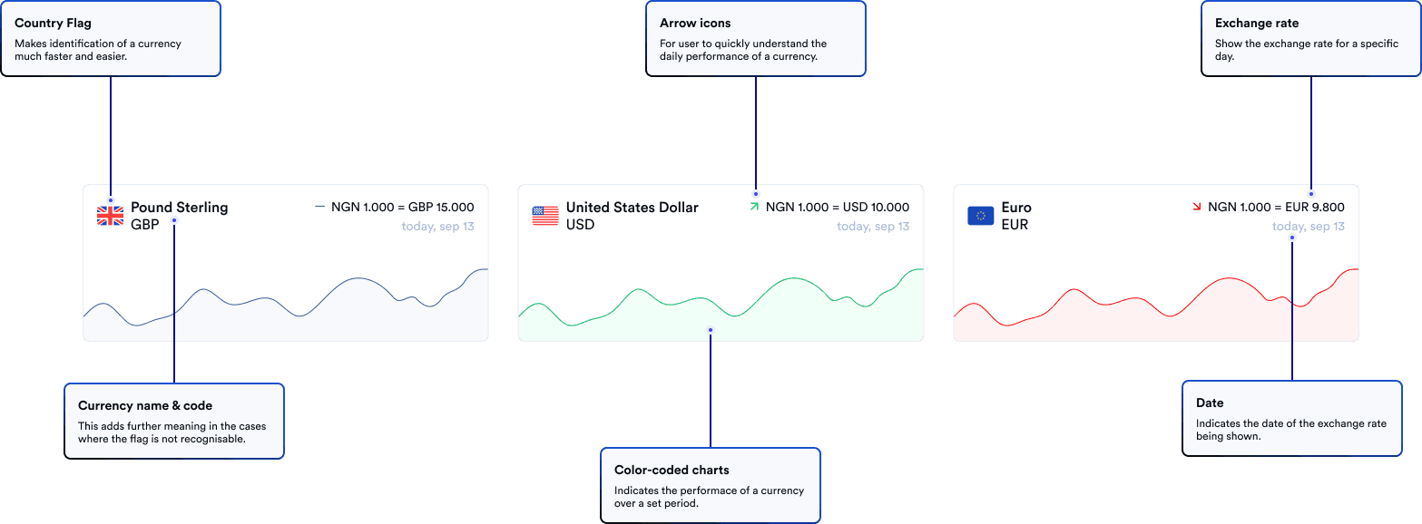
The arrow next to the selected currency was not clear whether it was static or changed to reflect the currency’s performance. Adding a visual indicator of the currency’s performance, such as using red or green to indicate a decline or increase, would make it easier for users to quickly understand the performance of a currency.

The layout of the form for initiating a transaction was confusing and did not follow the natural gaze pattern of users. Adding some text to explain the steps or redesigning the layout to better guide users through the process would improve usability.

The header had low color contrast, which made it difficult for users to read the text.
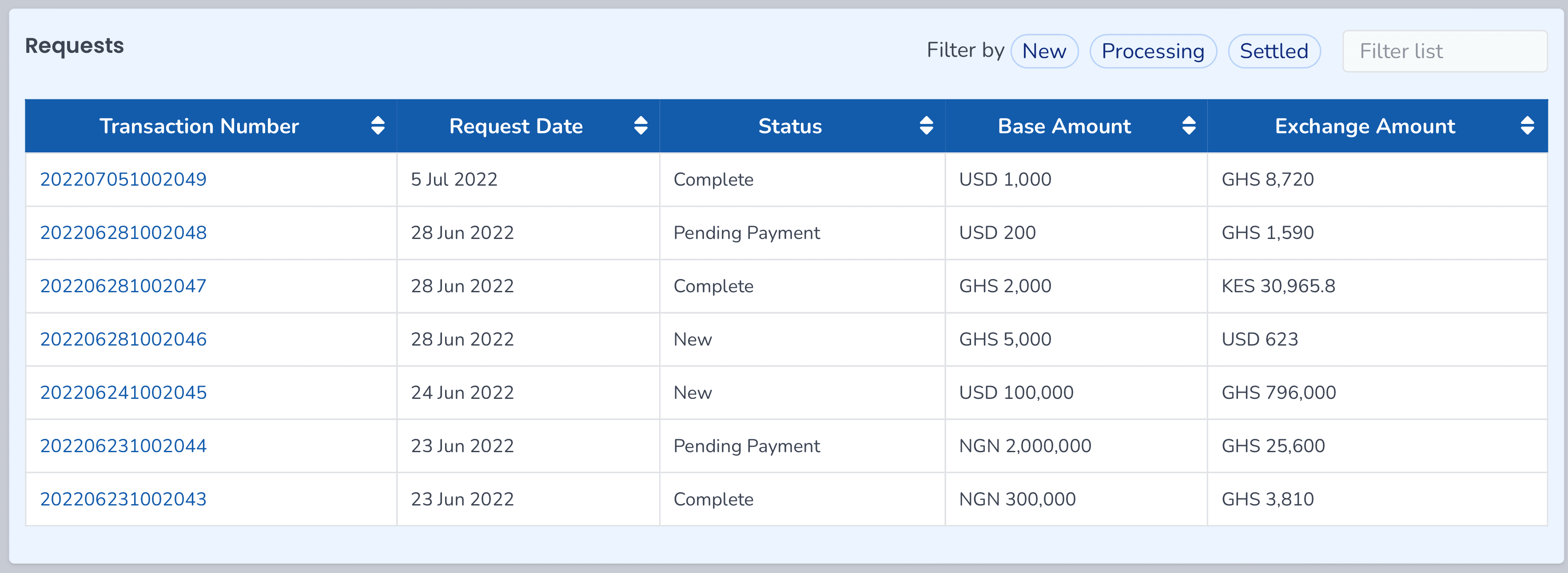
The table for displaying transaction data was not clearly organized and required a lot of effort from the user to process and understand. A more visually organized table, such as using different colors or icons to indicate the status of each transaction, would improve the user’s ability to quickly understand the data.
Ideation
Dashboard Navigation
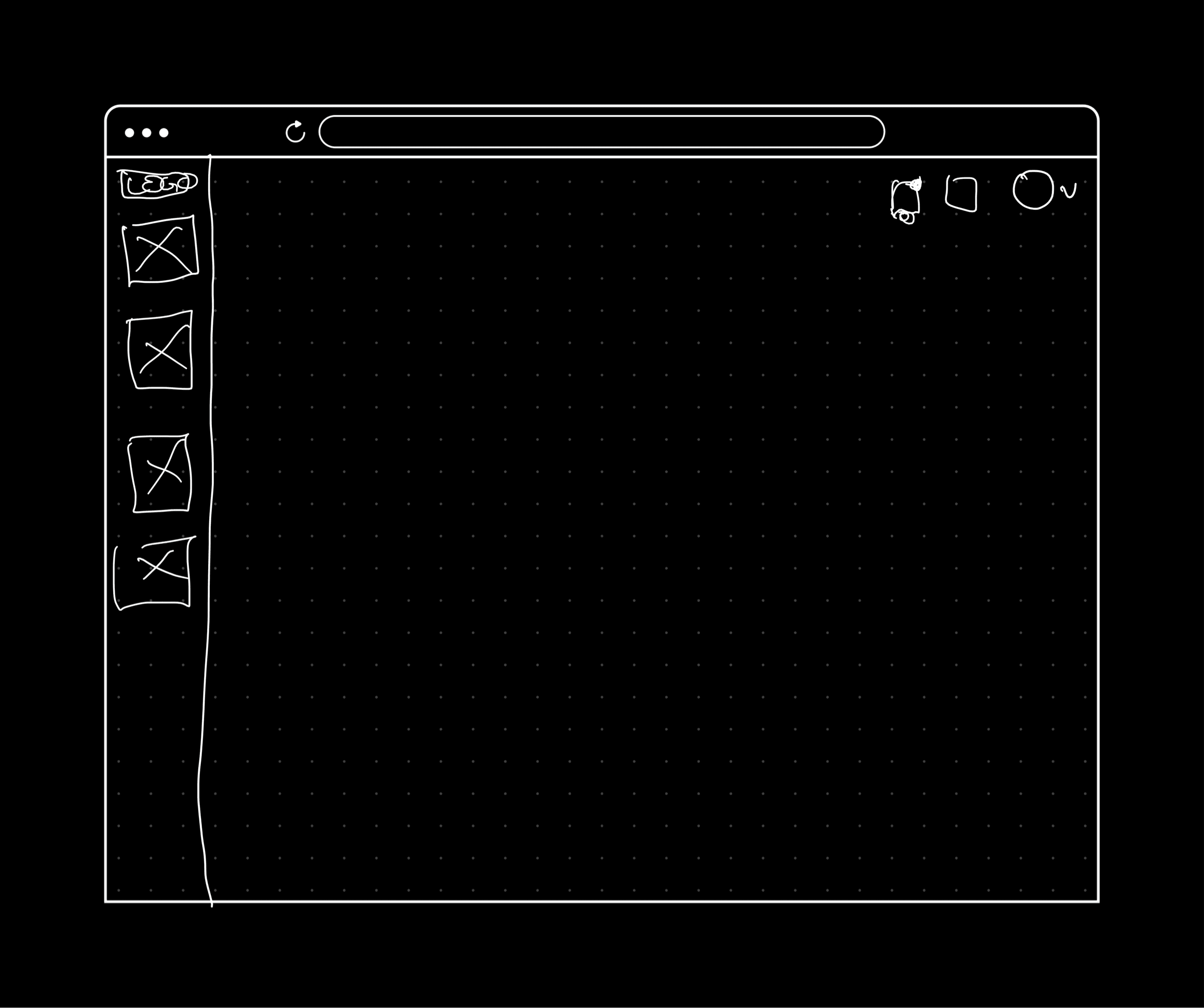
To improve the navigation of the dashboard, I explored several design options for the dashboard navigation, including:

Sketch One
On the left menu:
There are 4 links grouped by level of importance i.e Primary links (Dashboard, Trade) and Secondary links (Settings, Report Bug)
On the top menu:
There is the logo on the left to remind users of which platform their on.
There’s the notification icon to keep users informed on some of the things happening on the platform.
The user’s profile icon to interact with links and actions tied to their account eg. My Profile, SIgn Out, etc.
Finally, I added a “Trade” CTA to allow users to easily perform transactions no matter which page they may be on.
Sketch Two
The second looked fairly simple. My idea was come up with a more condensed navigation just so there will be more room for data to be dsiplayed on the dashboard to foster better analysis.
On the left menu:
Only icons for the various links are displayed without the text.
At the top:
Notifications, user profile icon, and one other icon for the bug report interaction. The intentions was to hide the Settings under the User Profile drawer.
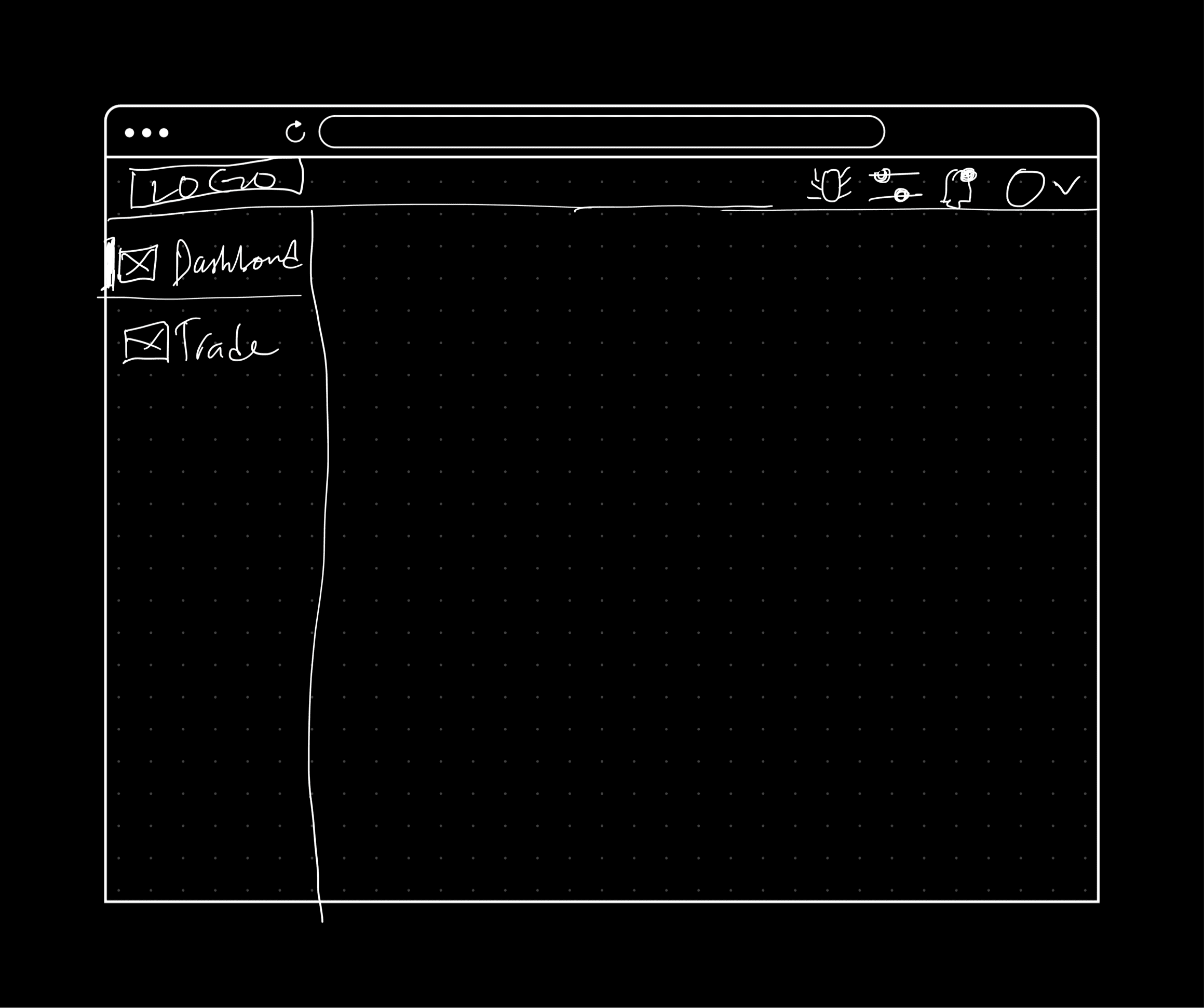
Sketch Three
This is similar to Sketch One. Major difference is the secondary actions have been moved from the left menu to the top menu. Reason for this was to have all the non-primary navigations elements in one place.

Sketch Four - Conversational AI
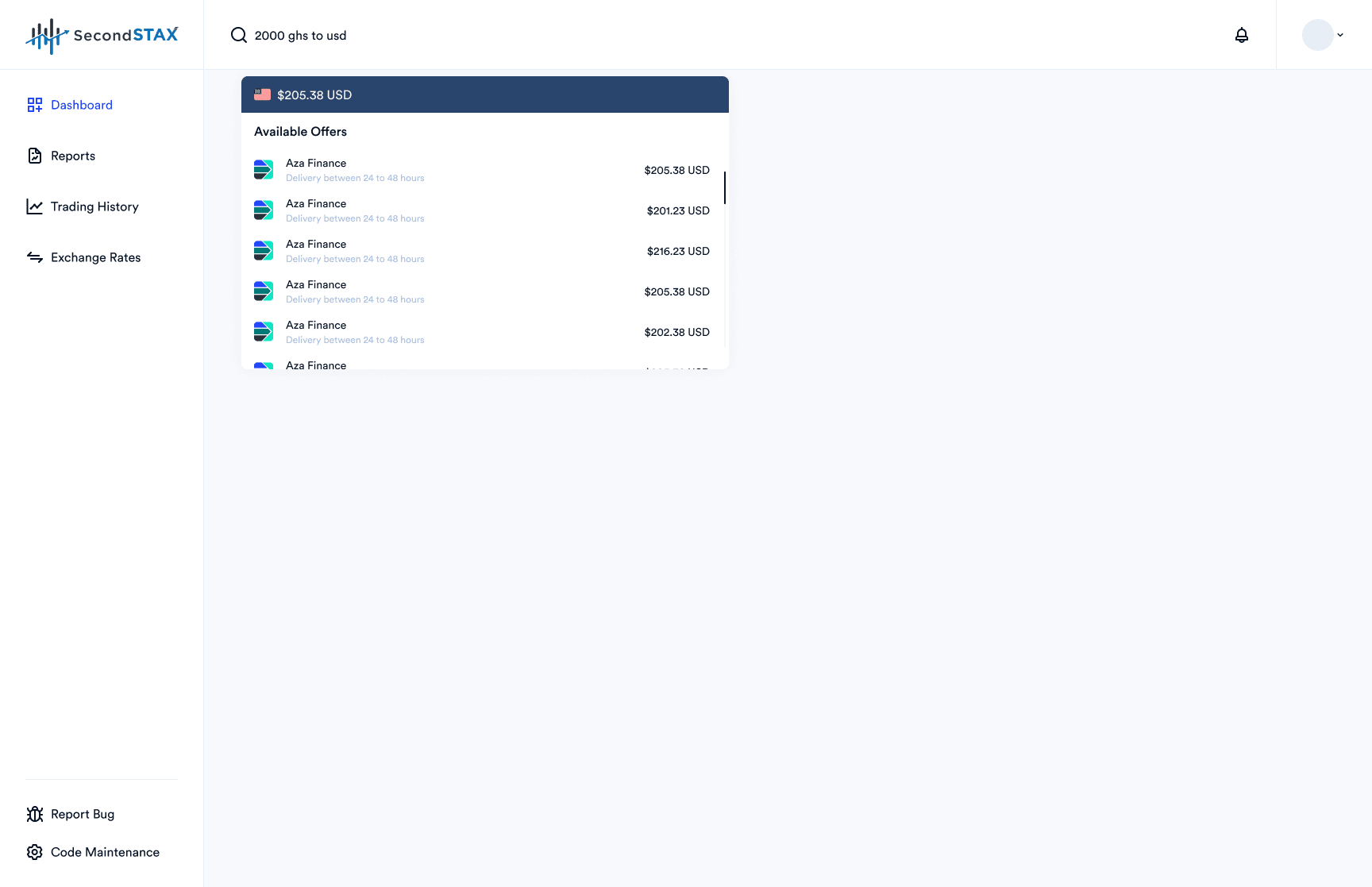
For this iteration, I transformed the trade flow to work more as a conversational AI. My idea was to find a more dynamic way for users to find exchange rates for various currencies and quickly trade if they find a good deal while leveraging on the chat UX patterns they are already familiar with from apps like WhatsApp.
Example:
A user enters “ GHS 2000 = USD” in the Quick Trade search.
The user is shown a list of offers from multiple providers instantly from the “search dropdown”. No need for an extra click to search
User can then continue the process from there
Navigation High Fidelity Mockups
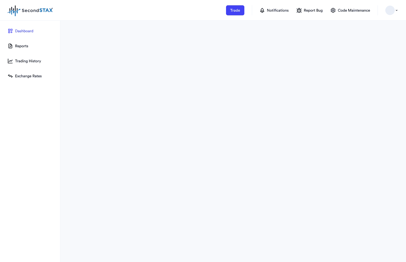
For the high fidelity mockups I left out Sketch Two. Primary reason being users could find it difficult navigating the platform compared to the other options that had text attached to each icon in the menu for users to clearly understand what it was. I replaced Sketch Two with a variation of Sketch Three which add text to each of the icons in the top menu to help users understand some of the not-so-universal icons there.


User Testing
Poll
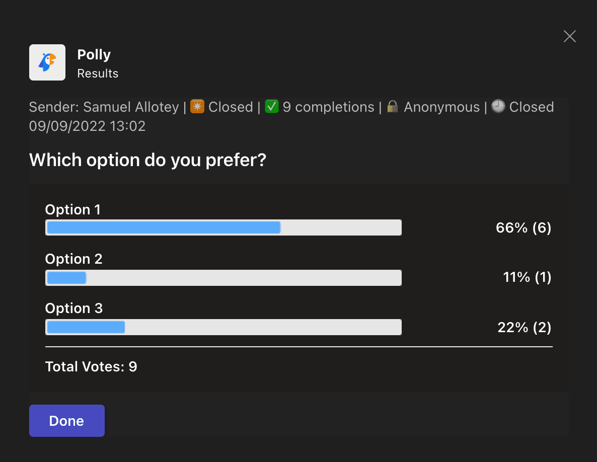
I ran a poll to decide which option people preferred the most amongst options one, two, and three. I left out option four - i.e the one with the conversational AI - mainly because it felt too advanced for the user base at the time. Below are the results of the poll.
Colorblind Test
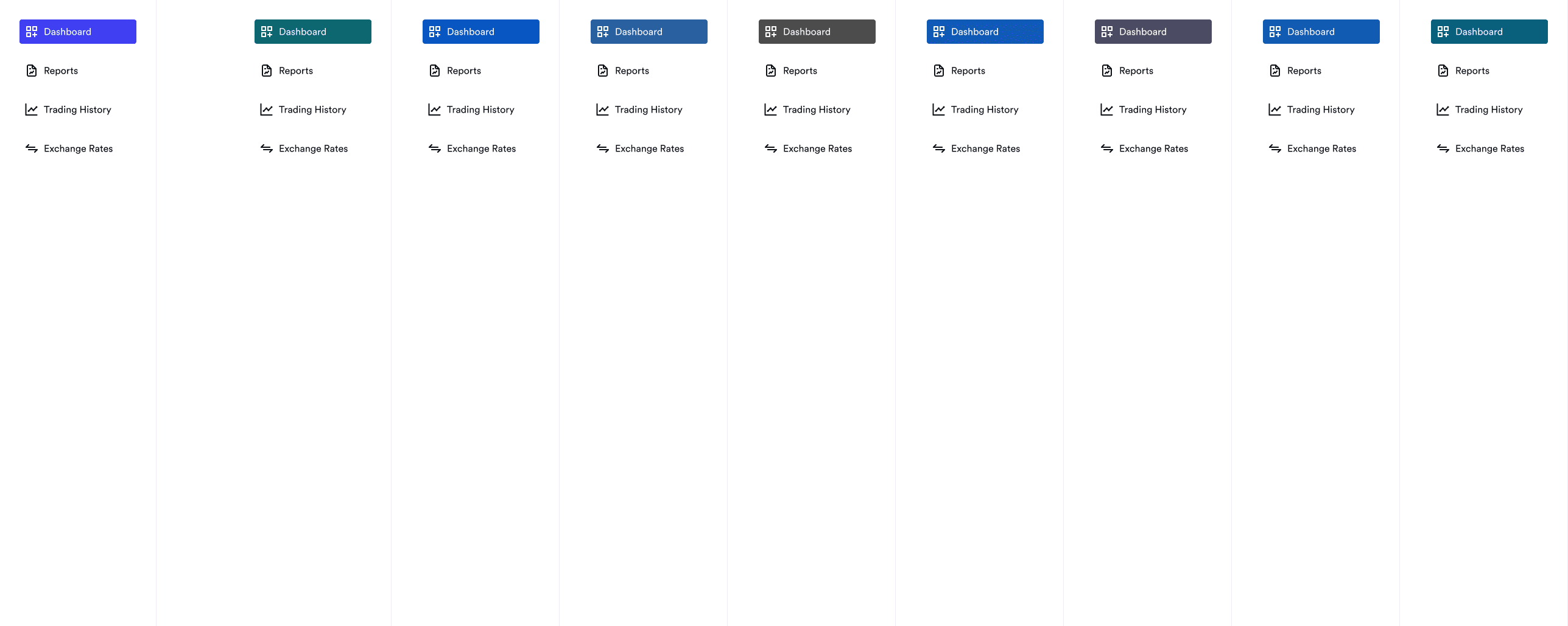
To ensure the navigation was accessible to visual impairments, I run a colorblind test to test for some of the most common colorblind impairments.


Three new options
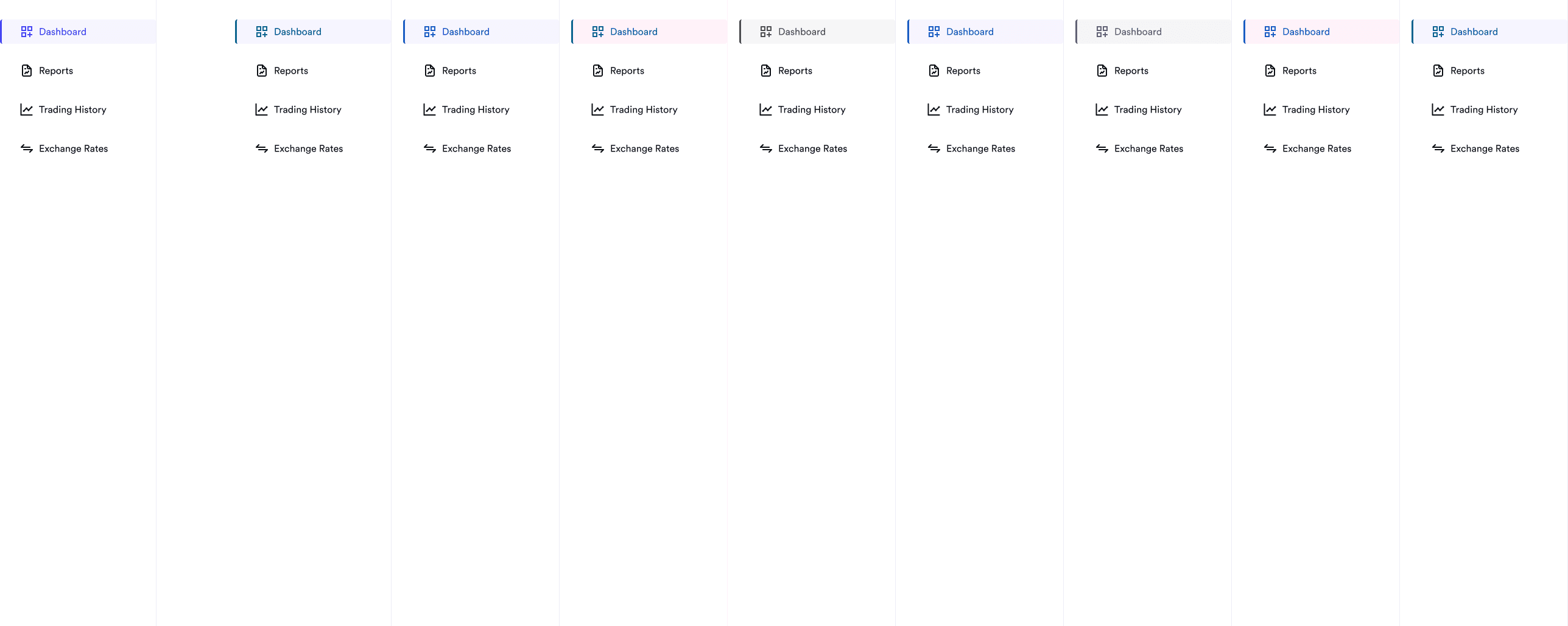
From the test I realised I needed a better way to highlight the active page. I came up with three new options of the left nav and ran another colorblind test on each one.
Option One
This option provided the best contrast making it much easier to be identified by users with visual impairments. However, the vibrance of the solid color used made it feel a bit overpowering and could also potentially take some focus away from other more important elements.

Option Two
For option two I was trying to find a more toned down version of option one. The idea was to find a more subtle to communicate the active page. However this option does not make it easily apparent which page is active.
Option Three – Winner
This is a cross between option one and option two. I merged the good parts of both options – i.e the fill of option one and the border of option two then toned down the fill color so it does take attention take attention away from other more important elements on the screen. The position of the border highlight on the left falls in line with the user’s natural reading pattern (left to right), hence, makes it easier for the user to quickly identify the active page on the menu.
Component Design
After sorting out the navigation design, next was to work on the main dashboard area. Prior to doing this, I had built out some of the components required for the dashboard in the design system. This sped up the workflow allowing me to skip the sketching and wireframe phase for this part.
Charts
For the chart design I was looking for a way for users of this dashboard to view and immediately understand how a currency is performing against the top three i.e Pound Sterling, US Dollar, and Euro.
Request Tables

Other Components

