
GatePass tickets + schedule view
Event ticketing and video-first discovery app. 0→1 consumer mobile design, sole designer.
- Role
- Lead Product Designer, sole designer
- Type
- 0→1 consumer mobile app
- Platform
- iOS / Android
- Tools
- Figma, FigJam
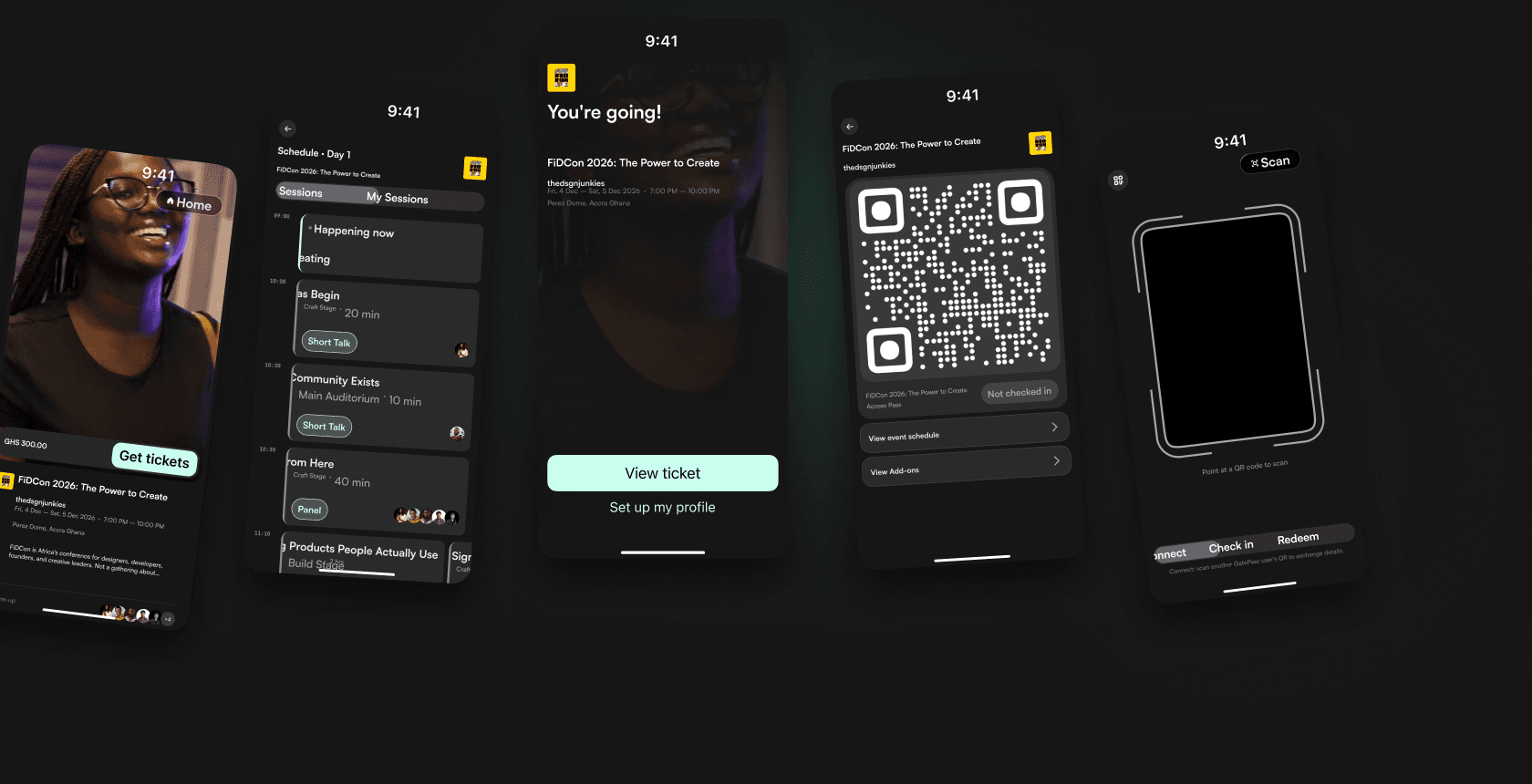
It starts with a video you didn't film. Someone else's night out, someone else's front row, showing up in your feed hours after it happened. You watch for a few seconds and move on, the way most people do most nights. That small, familiar moment of watching an event you weren't at is the reason GatePass exists in its current form. Every ticketing product on the market assumes you've already decided to go somewhere. GatePass starts one step earlier, in the scroll, before that decision has even happened.
Overview
GatePass is an event technology platform with two distinct surfaces: B2B organiser infrastructure covering ticketing, access control, session management, check-in, and audience analytics, plus a B2C consumer app built around video-first event discovery. The platform serves the full event spectrum, from conferences and festivals to concerts, corporate events, award shows, and brand activations.
This case study documents the design of the consumer mobile app, from first principles through to near-complete, handoff-ready screens.
Ticketing, access control & check-in for event organisers. Discover events through video.
The Problem
Africa's events industry is growing rapidly. More conferences, more festivals, more community experiences. But the systems behind these events haven't evolved at the same pace, and the way people discover events remains static, fragmented, and disconnected from how modern audiences consume content.
Three problems defined the brief.
For organisers: Every event starts from zero. A new ticketing system is set up, a new check-in process is created, a new attendee list is collected. Data is lost once the event ends. There is no persistent infrastructure that connects events over time and turns attendees into a lasting asset.
For attendees: Event discovery is passive and indirect. People find out about events through word of mouth, social media posts, and WhatsApp messages. The purchase experience is transactional and forgettable. There is no dedicated product experience for the attendee before the event, during it, or after it ends.
For the industry: Available ticketing tools are either imported solutions built for Western markets or rudimentary local alternatives. Nothing is purpose-built for how African events actually operate: high-volume Mobile Money environments, informal distribution networks, multi-tier events with sessions, workshops, and add-ons layered on top of general admission.
The opportunity was to build the infrastructure layer and the consumer layer at the same time, so the data generated by the consumer experience becomes an asset for the organiser, and the organiser's event data enriches the consumer experience.
Design Philosophy
Before any screen was designed, a single north star was established and held throughout every decision:
Three principles followed from this.
Context over convention. Every design decision was evaluated against its specific context: this user, this moment, this intent, rather than against what ticketing apps typically do.
The system absorbs complexity. Wherever there was a choice between making the user manage something or making the backend manage it, the backend absorbs it. The single-QR architecture is the clearest expression of this. One code. Show it everywhere. The system knows what to do with it.
Emotional register matches the moment. Purchasing a ticket feels like anticipation. Checking in feels like arrival. Networking at an event carries its own energy. A past ticket becomes a memory. Each screen was designed to match the emotional register of the moment it appears in, not a generic "event app" tone applied uniformly.
Process
The design followed a deliberate sequencing before any screens were opened in Figma:
Information architecture → User flows → Content inventory and naming decisions → Design system → Screen design
Strategic questions were asked at each transition point. Same file or new file? Separate surfaces or connected? Content inventory now or later? This sequencing discipline prevented the most common early-stage design failure: jumping to screens before the underlying decisions are made, then rebuilding after they are.
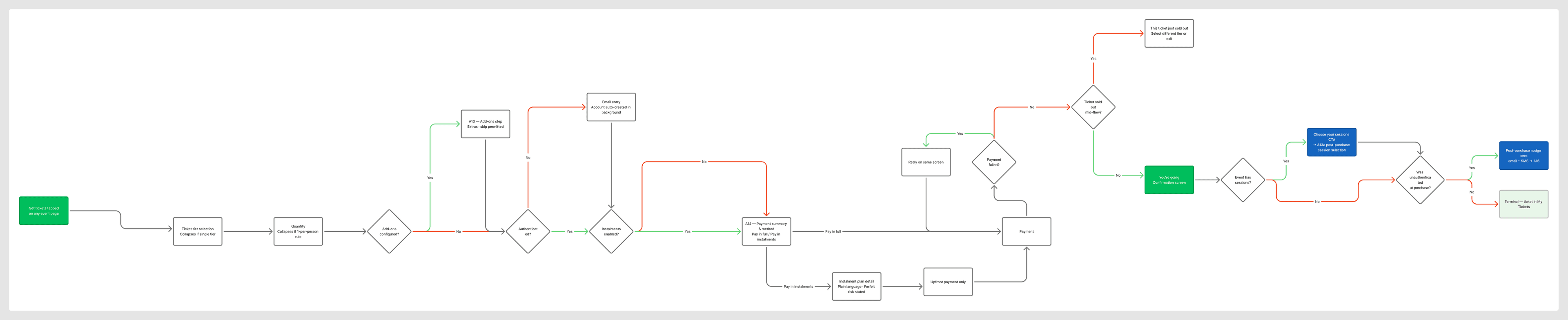
User flows were mapped in FigJam before any screen was designed. All flows moved strictly left to right. Each was structured around trigger, terminal state, complexity rating, and edge cases.
Design System
Dark-mode first. Events happen at night, and the product should feel native to that environment.
The colour system is built as a full semantic token library rather than a flat set of hex values. Four categories, each with multiple states: Background (Default, Subtle, Muted, Emphasis, Inverted, Info, Success, Attention, Error, Dark Error), Border (Default, Subtle, Booker, Error), Text (Default, Subtle, Muted, Inverted, Info, Success, Attention, Error), and Brand (Default, Subtle, Muted, Accent, Emphasis). Twelve semantic slots in total, each backed by a real GatePass brand colour rather than a generic grey or blue.
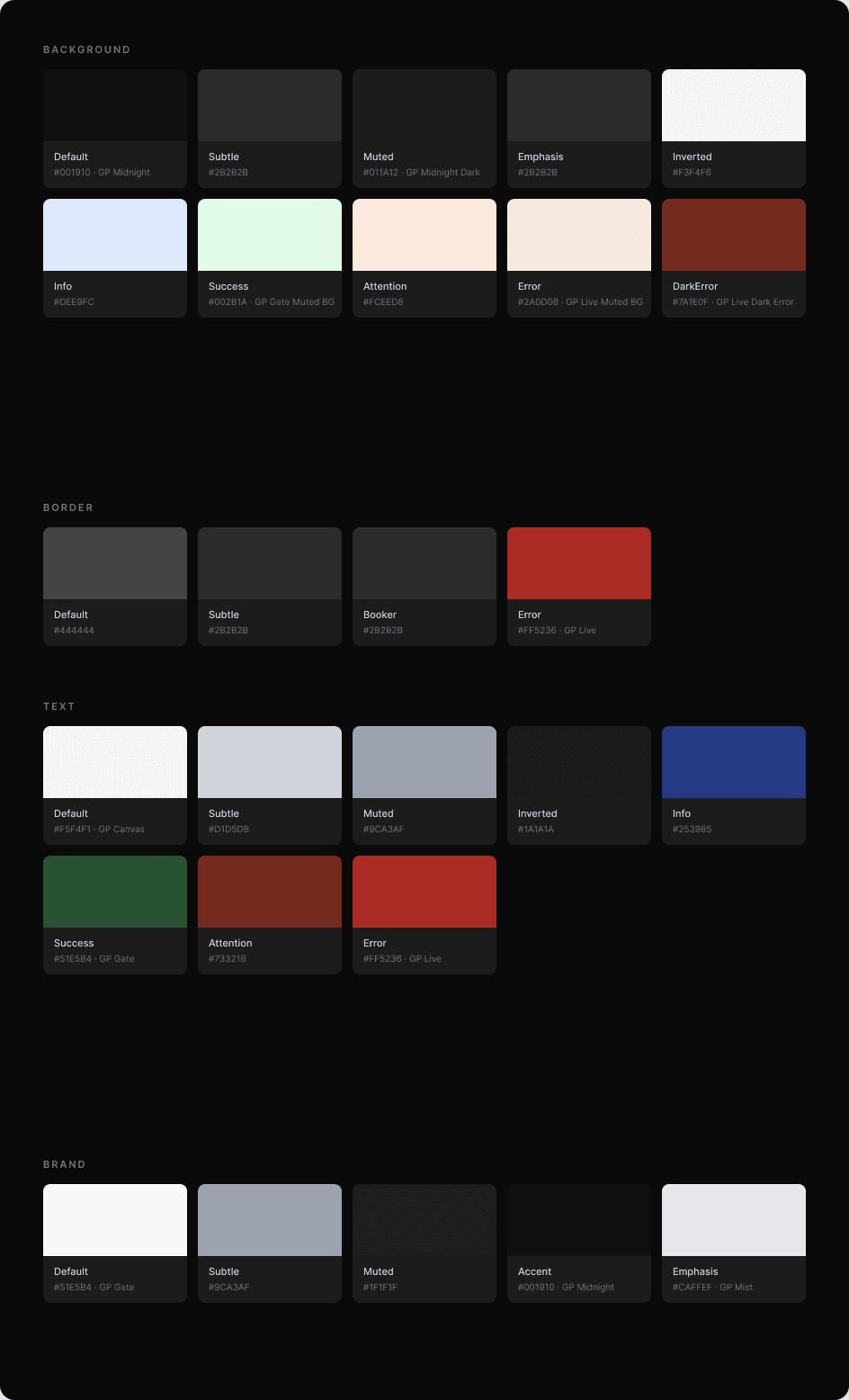
The core brand palette threading through those slots: GP Midnight #001910 and GP Midnight Dark #011A12 anchor the darkest backgrounds. GP Gate #51E5B4 is the primary accent for confirmations, check-ins, and active states. GP Mist#CAFFEF fills CTAs on dark backgrounds. GP Canvas #F5F4F1 is the default text colour. GP Live #FF5236 carries urgency, errors, and denied states. Amber #F5A524 marks staff mode, payment-due, and pending states.
Designing colour as a semantic system rather than flat values means every state (hover, muted, emphasis, error) already has a considered answer, and the whole palette stays coherent as new screens get added instead of accumulating one-off greys picked by eye.
Staff-facing screens shift the entire visual accent from green to amber: every corner bracket, every pill, every CTA. That creates an unmistakable operational register in a high-pressure queue environment.
Typography: Satoshi (Inter as plugin fallback). Screen size: 428×926px, built at the largest target size and scaled down.
Onboarding
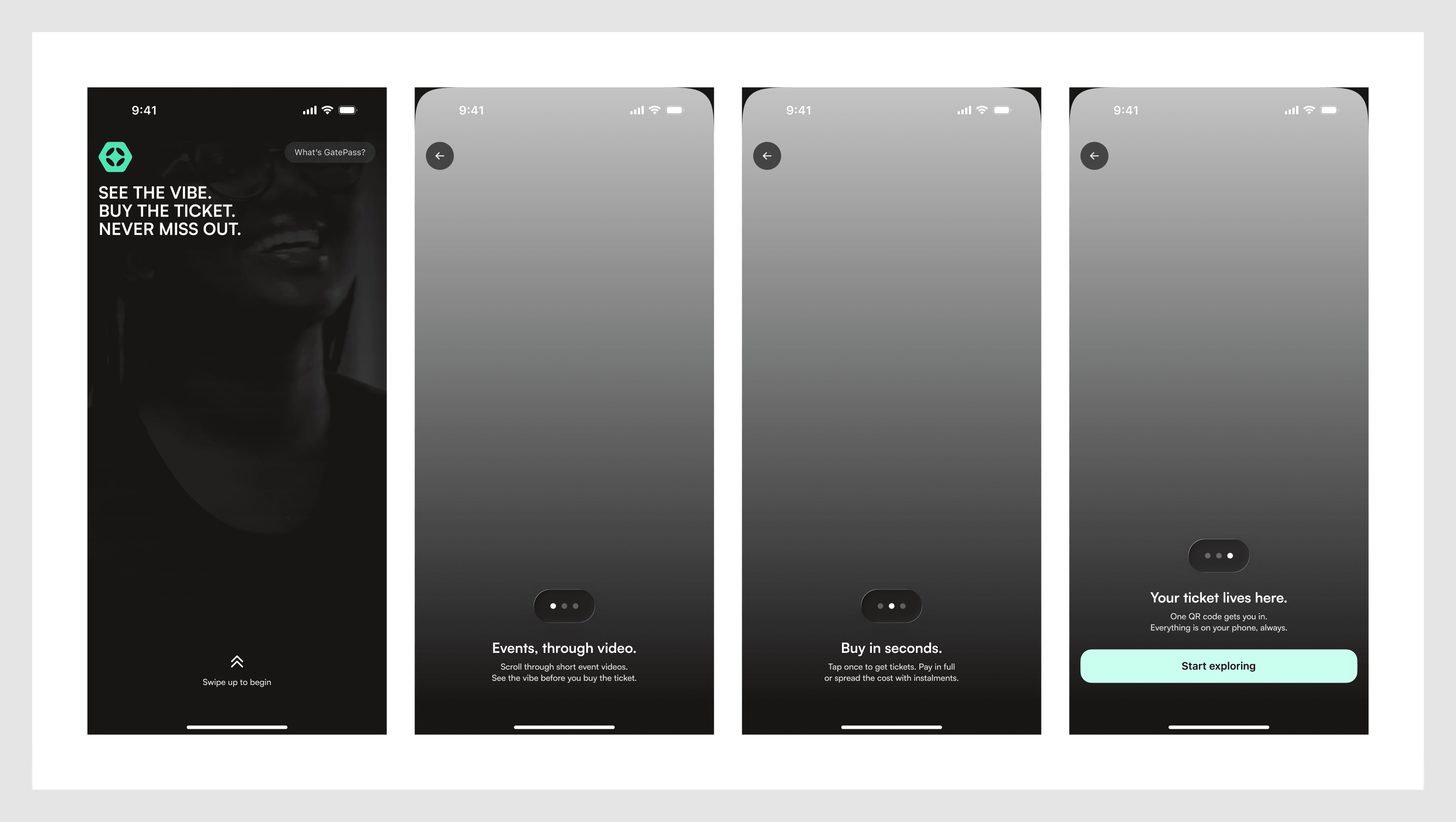
Swipe-up is the primary first gesture, deliberately mirroring the video-native feed that follows. The "What's GatePass?" explainer is intentionally secondary, since most users arrive via a shared link and already have context.
The Consumer Feed
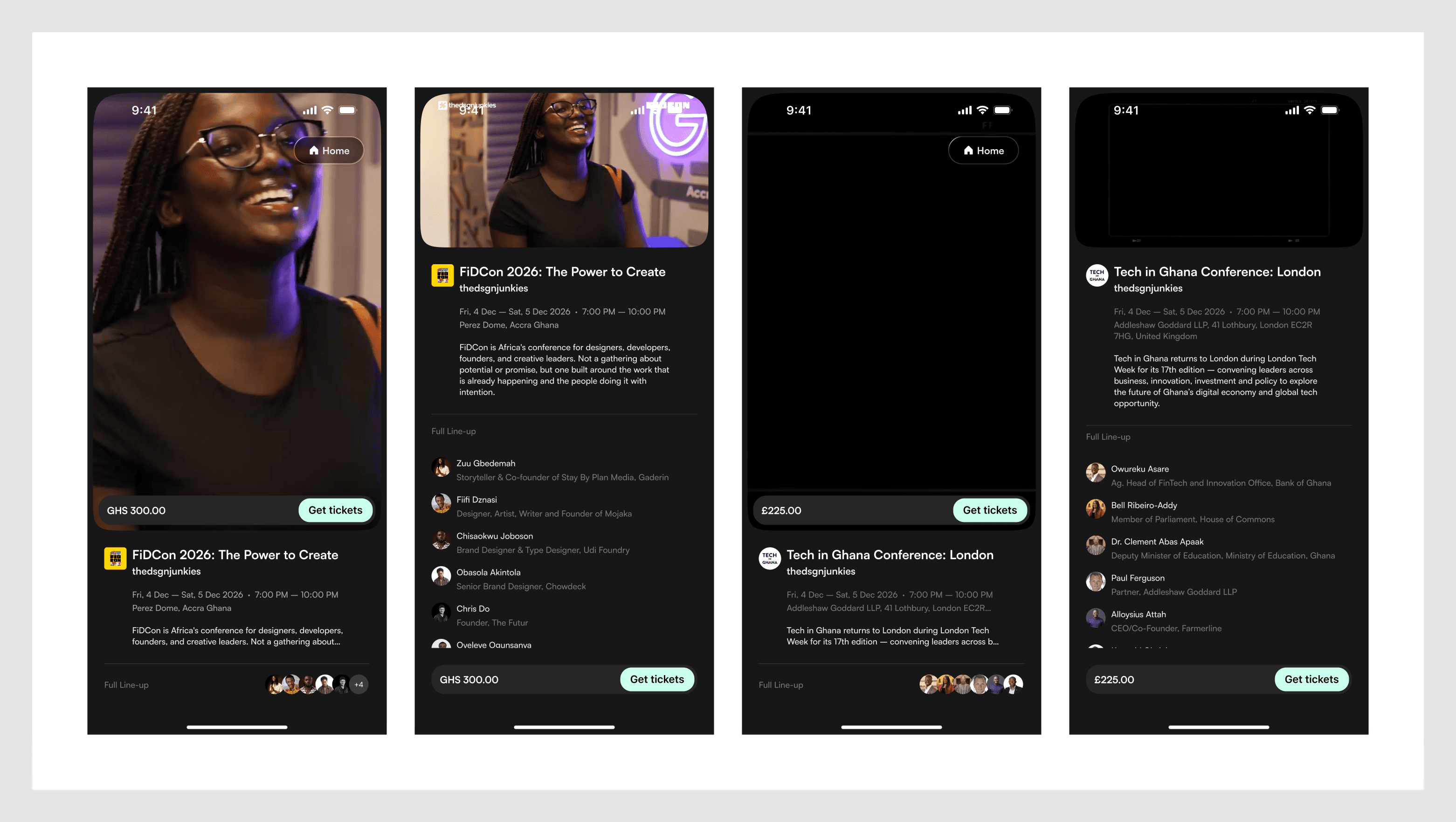
The consumer insight that anchored everything: GatePass turns passive observers into active participants. Most people discover events by watching other people's stories and posts about them. They're spectators of an experience someone else is having. The feed turns that spectator position into participation. You see the vibe, you buy the ticket, you go.
Full-screen event videos, swipe-up to browse, tap to expand event detail. The gesture vocabulary is borrowed deliberately from TikTok and Reels, since the target audience has already internalised it.
The Checkout Flow
The checkout had to serve two very different user types at once: the impulsive buyer arriving from a shared link who wants to complete a purchase in under two minutes, and the considered buyer who wants to understand every detail before committing.
Sequence: Ticket tier selection → Add-ons → Attendee details → OTP verification → Checkout review → Payment → Confirmation.

Session selection was removed from checkout. An early flow included session registration between add-ons and checkout review. This was decoupled and moved to post-purchase. The reasoning: purchasing a ticket and selecting sessions are two different cognitive acts. The first is a financial commitment (will I go?). The second is planning (which sessions will I attend?). Conflating them adds complexity at the wrong moment.
OTP authentication removes the password. No username, no password, no forgotten credentials at the door. Enter phone or email, receive a four-digit code, verified. The account is created silently in the background.
Group Ticket Distribution
One of the highest-friction moments in any ticketing product is group purchase. The buyer ends up managing multiple tickets, forwarding screenshots, chasing receipts. GatePass eliminates this structure entirely.
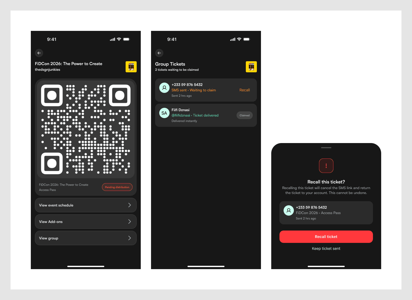
After selecting quantity greater than one, a "Who's joining you?" step appears. The buyer's own ticket is auto-assigned. Each additional ticket gets a recipient field that accepts an @username (resolved in real time, with avatar, name, and company shown before confirming), a phone number, or an email address.
@Username recipients already on GatePass receive their ticket instantly with a push notification. Non-GatePass recipients get an SMS/email claim link. The buyer's My Tickets shows a Pending Distribution section with amber accents. Each unclaimed ticket shows who it was sent to, how long ago, and a Recall option.

The Ticket & Instalment System
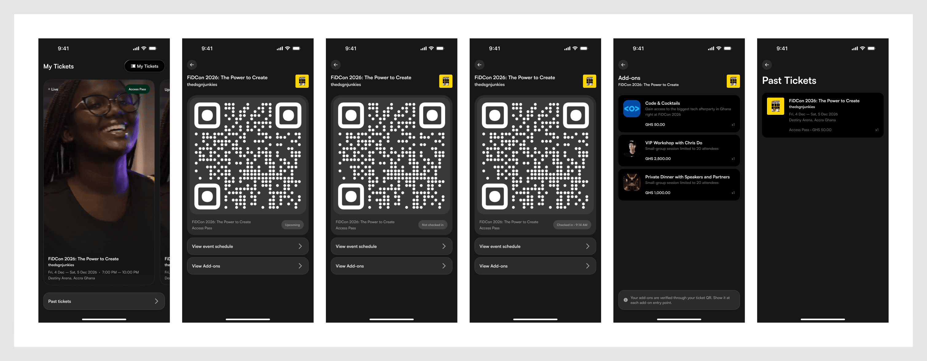
The ticket screen is the most emotionally weighted screen in the product. It's what the user looks at while standing in the queue, so it needs to be unambiguous, instantly readable, and feel worth paying for.
No equivalent to the instalment plan exists in any African event ticketing product today. A buyer can secure a ticket with a partial payment and spread the rest across scheduled payments before the event.
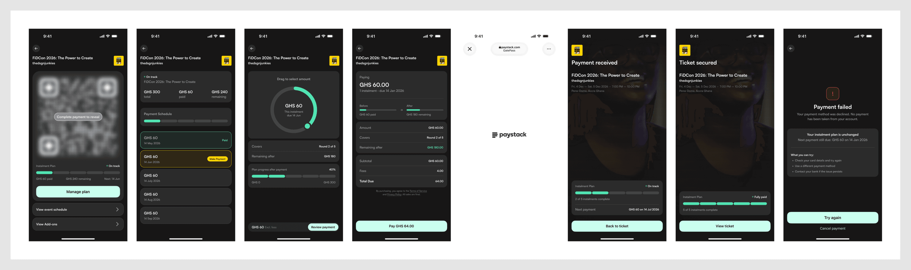
The dial. The original design used a bullet list to select the instalment amount. It was replaced with a radial arc dial: four snap points, tactile interaction, nothing like it in any competing product. It was prototyped interactively before being built in Figma, to validate the concept first.
The three-card payment schedule. Paid (green border), Due (amber border, amber "Make Payment" pill), Upcoming (neutral). One resolved debate: should the Due card's pill be amber or MIST green? Amber won. The border already carries the urgency signal, and a green pill would introduce a competing signal on a card that should communicate one thing.
The order review screen wasn't in the original spec. It was identified as a gap and added between the dial and the payment processor. It shows a before/after progress bar, which eliminates mental arithmetic and makes the consequence of the payment visible before the money moves.
Schedule & Sessions
This is the most architecturally complex surface in the consumer app. It has to serve casual attendees who just want to know what's next, and deeply engaged attendees managing a full personal agenda across a multi-day conference.
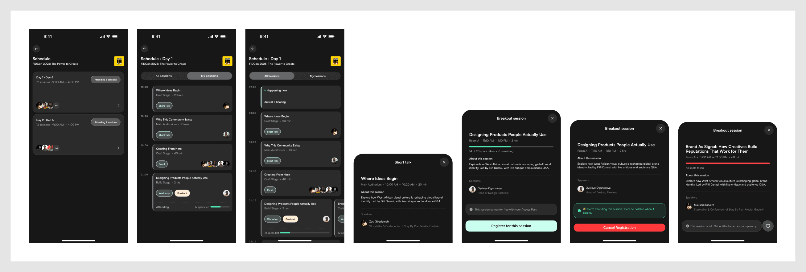
The day selector was critiqued early. The first version had too much empty space for what it communicated. The iterated version added speaker avatar stacks, session count, time range, and an "Attending X sessions" chip that turns GATE green once sessions are registered.
The NOW indicator, a red hairline across the session list marking the current time, was added as an unrequested enhancement. During a live event, the user always knows exactly where they are relative to what's happening.
Parallel sessions are shown side by side rather than stacked, which honestly represents the actual choice an attendee is making instead of implying a false sequence.
The registration sheet transforms in place on success. No navigation, and the scroll position is preserved on dismiss. Most event apps get this wrong.
Browse & Search
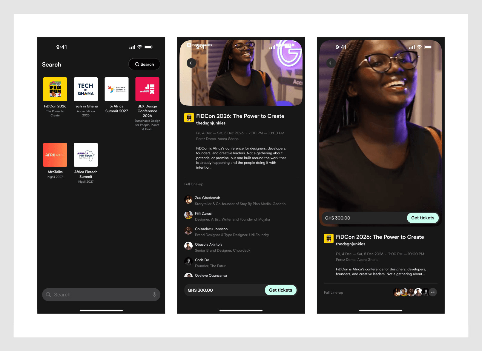
For users who arrive with intent rather than relying on the algorithmic feed. Category-based browsing and direct search sit behind the feed as a secondary discovery surface.
The Scan Feature
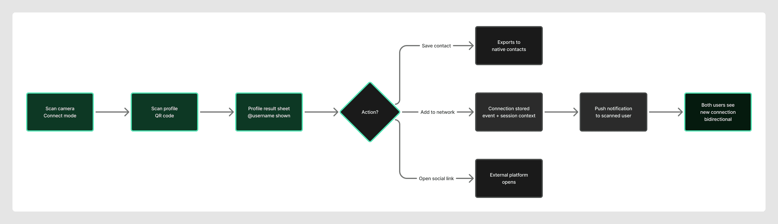
This is the most operationally critical surface in the product. It serves both consumers networking at events and staff processing entry queues, through the same physical camera interface.
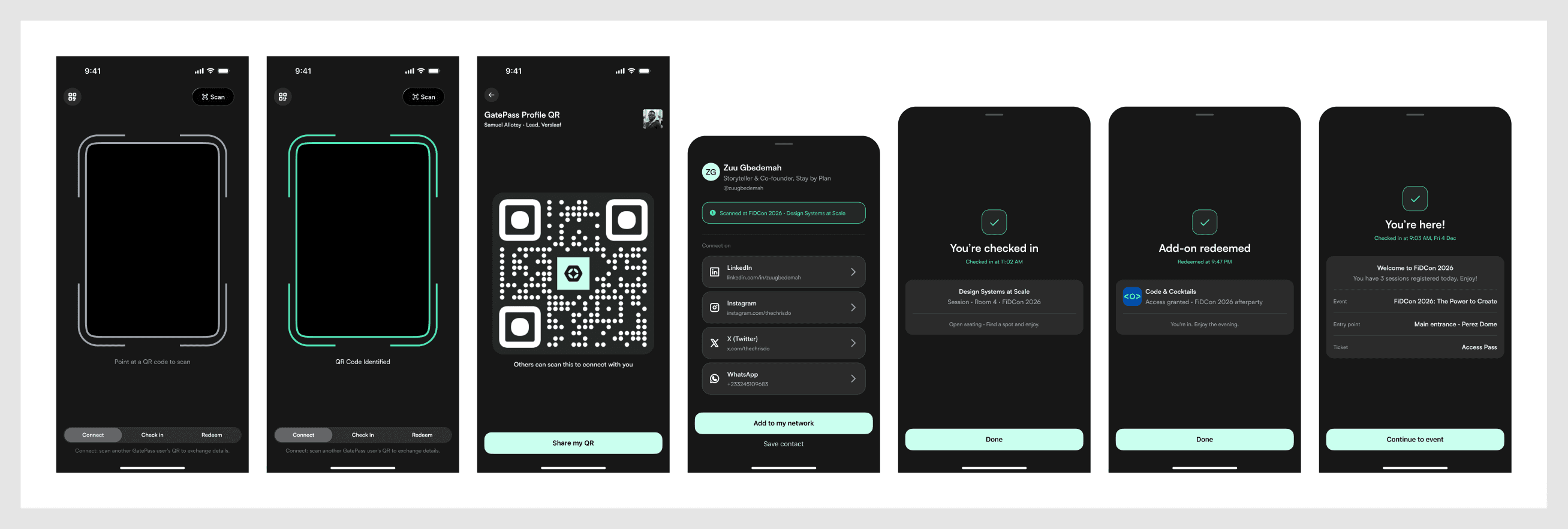
Context-first, not scan-first. The user declares what they're scanning for before aiming the camera: Connect, Check in, or Redeem for consumers. This prevents the most common operational error, which is processing the wrong kind of scan because context wasn't set first.
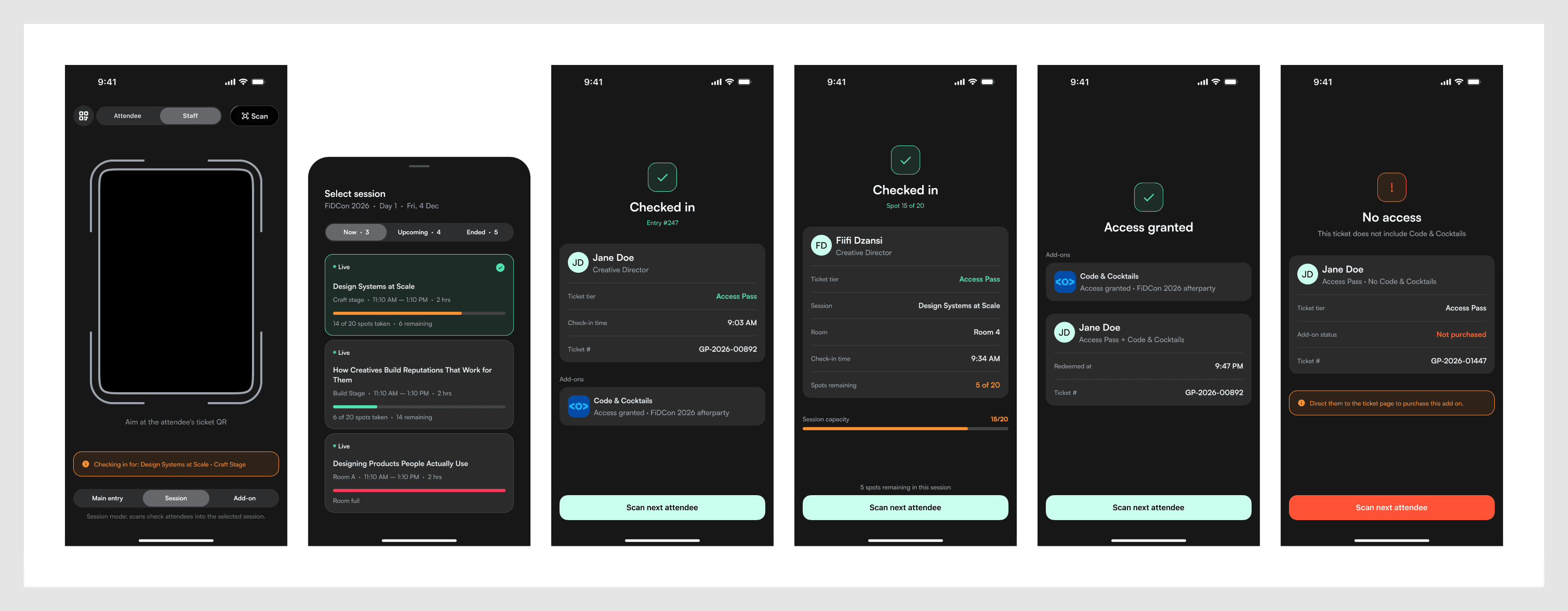
The staff mode colour shift. Tapping "Staff" turns the entire interface amber, from the scan reticle to every pill and CTA. In a high-volume queue, an accidental mode switch can't be a subtle UI change. This makes it impossible to miss.
Staff selecting a session to check into see a live capacity bar for every concurrent session before scanning. Pre-assigned sessions are highlighted but not locked, because real events require flexibility. The main event check-in result shows a running entry counter ("Entry #247"), operational intelligence surfaced exactly when it's useful.
Bidirectional networking. Scanning another attendee's profile QR connects both people automatically. The connection record permanently stores the event and session context ("Met at FiDCon 2026, Design Systems at Scale"), which is the entire differentiator from a generic LinkedIn connection.
Profile, Network & Identity
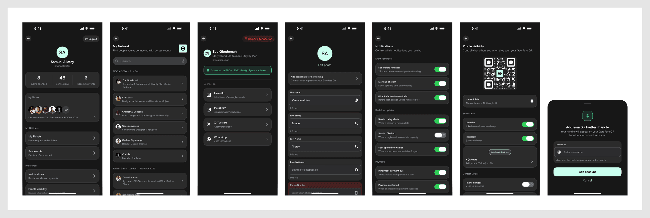
@Usernames were introduced for two connected reasons. They make a user's GatePass identity portable outside the app (business cards, bios, DMs), and they give group ticket distribution a clean, verified addressing mechanism. There's one shared namespace across consumers and organisers. A 30-day reserve on changed handles prevents squatting. Every user gets a public profile at gatepass.so/@handle.
No traditional logout. This was removed in favour of contextual "Switch account" and "Remove this device" options. GatePass is a personal, persistent-session product, and a logout button optimises for a use case almost nobody has, at the cost of friction for everybody else. The one genuine edge case (a returning user with an expired session) is handled by a quiet, contextual re-authentication sheet.
My Network connections are organised by event, and each card carries the session context and timestamp of when the two people met, turning a list of names into a usable record for follow-up.
Help & Support
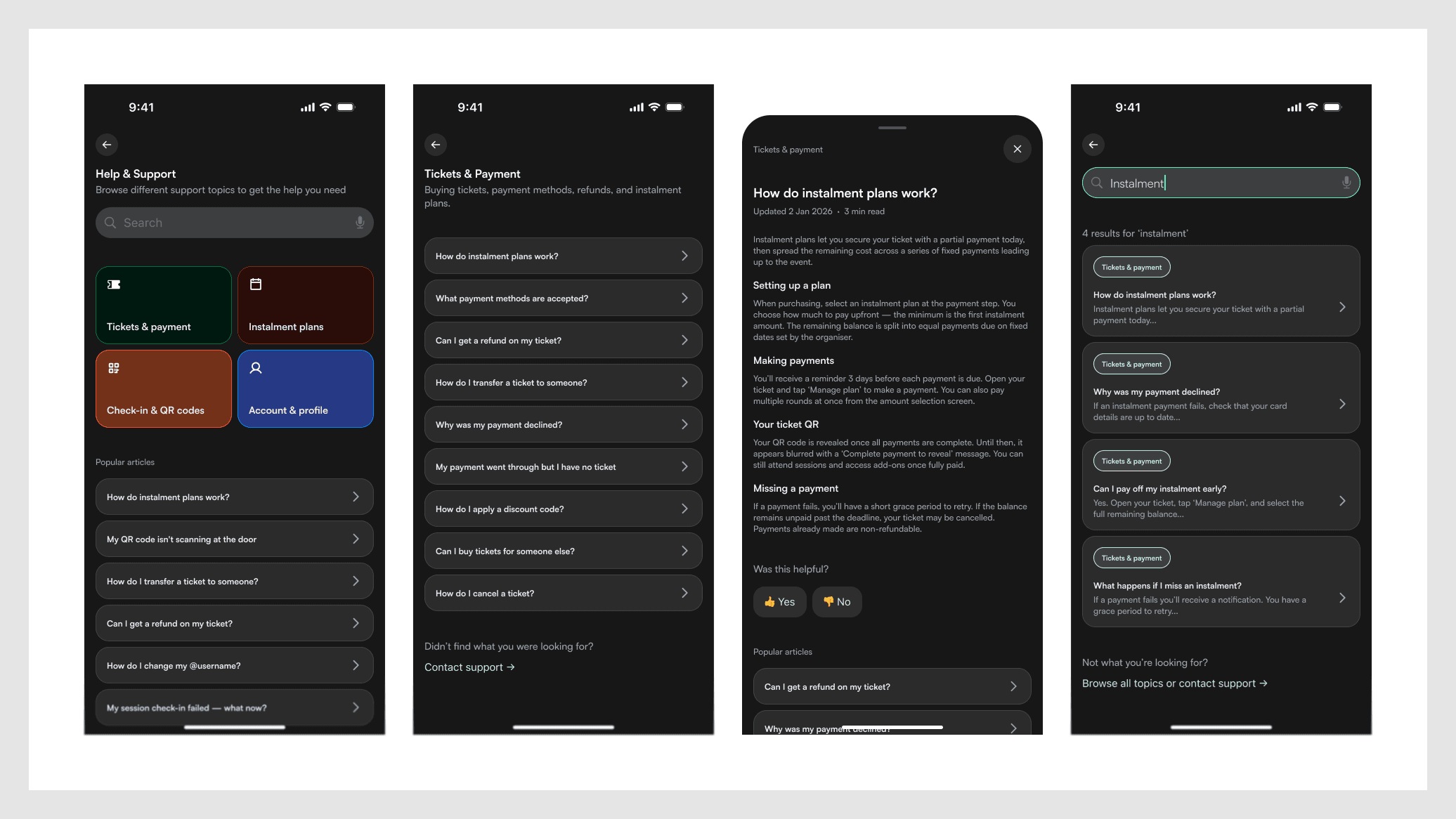
Articles open as an in-app bottom-sheet webview rather than a browser exit, so the user never loses their place. Search is native. "Chat with us" opens an embedded support overlay. "Send an email" is the one intentional, expected app exit.
The Ticket Claim Flow
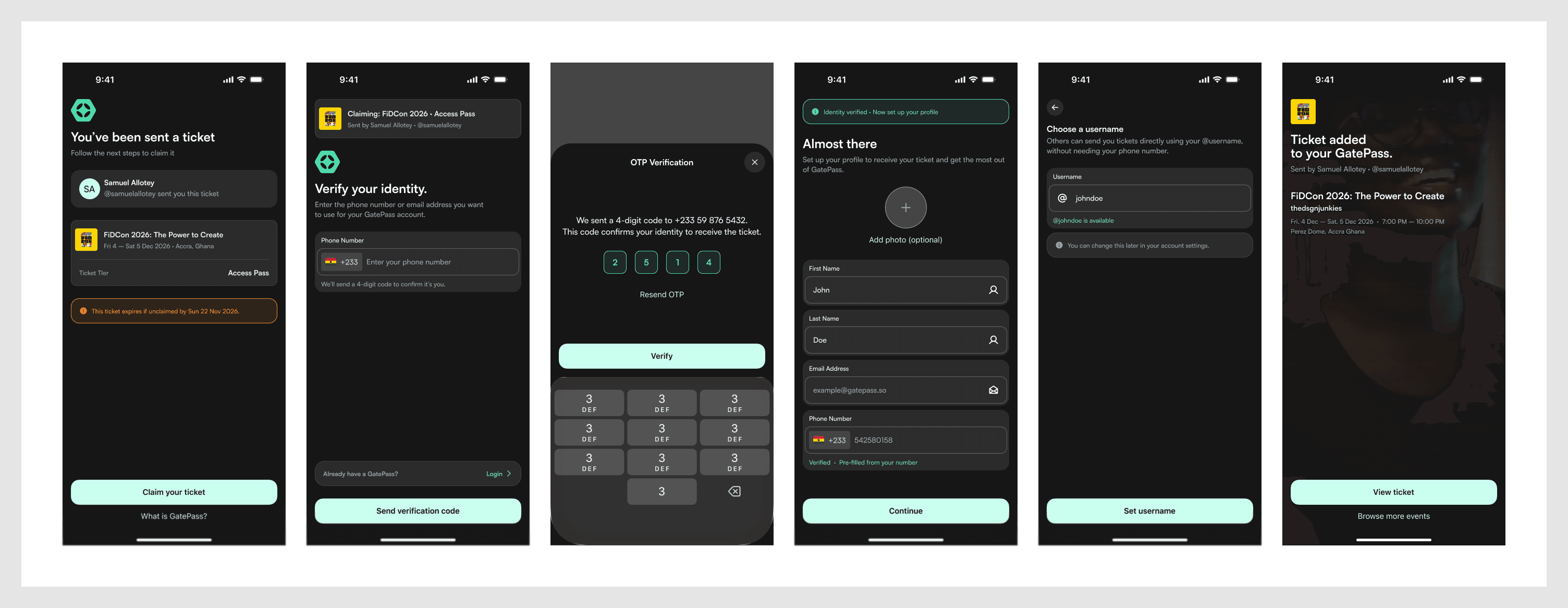
For recipients of a distributed group ticket who aren't yet on GatePass. Authentication is framed entirely around receiving the ticket, never around "creating an account." The sequence (claim landing, verify identity, OTP, profile setup, username setup, confirmation) reuses the same underlying screens as onboarding and checkout OTP, adapted with claim-specific copy and context at every step.
Key Debates and Resolutions
Session selection: checkout vs. post-purchase. Moved post-purchase. "Will I go?" and "which sessions will I attend?" are different cognitive acts with different optimal timing.
The instalment amount selector: list vs. dial. Three alternatives were evaluated (segmented pills, stepper, card grid). The dial won for its tactile, differentiated interaction.
The payment schedule pill colour. Amber, not green. A single unified signal per card beats two competing colours at a moment of financial consequence.
Logout vs. no logout. Removed. The real edge case (expired sessions) is better served by a contextual sheet than a button 95% of users never touch.
Auth upfront vs. auth at intent. Rejected showing login on the welcome screen or feed. An account only becomes meaningful at the moment something is placed in it.
Live streaming: build vs. integrate. Decided to integrate rather than build. GatePass handles the virtual ticket and access gate, and the organiser supplies the stream URL from whatever platform they already use.
Learnings
Pre-design sequencing turned out to be the real work, not overhead in front of it. Every hour spent on IA and flows before opening Figma saved multiple hours of screen redesign later.
Copy is design. Ticket chip states, CTA labels, and payment terminology got as much consideration as visual treatment. Language precision in a product handling money and event access is a design discipline, not an afterthought.
Emotional register is a design variable. The same confirmation screen can't serve a mid-plan instalment payment and a plan-complete ticket reveal. They're different emotional moments, and they were designed as such.
The system should be smart so the user can be dumb. The single-QR architecture is the clearest proof of this principle in the whole product, and the best design decisions in this product are the invisible ones.
What Was Designed
The consumer mobile app covers 13 sections in the Figma file: Onboarding, Feed & event detail, Checkout flow (including group ticket distribution), My Tickets & ticket detail, Instalment flow, Schedule & session registration, Browse & search, Scan (consumer mode), Scan (staff mode), Profile, network & account settings, Help & Support, and the Ticket claim flow.
What Comes Next
Remaining consumer-app work is mostly edge cases: scan error states, empty states, session conflict warnings, staff onboarding, offline handling, and the event page tab structure. The admin surface, the organiser dashboard across four distinct roles (Owner, Staff, Check-in Staff, Marketer), is the next major design phase. Future roadmap surfaces include a Session Engagement layer (live Q&A, polls, word clouds), an event content gallery, and live-streaming access via integration.
Reflection
GatePass is built on the idea that the event experience doesn't have to feel like infrastructure. Every interaction, from buying a ticket to showing up at the door to connecting with someone in the audience, can feel considered, well-designed, and worth returning to.
The decisions that matter most in this work are the ones you can't see: the QR that stays the same for everything, the auth that only shows up when it's needed, the instalment plan that reveals your ticket at the finish line. Those decisions are the design, more than any single screen is.
Showing the full case study.